LEVEL UP Highrise Railings Ltd.
Brand Identity | Logo Design
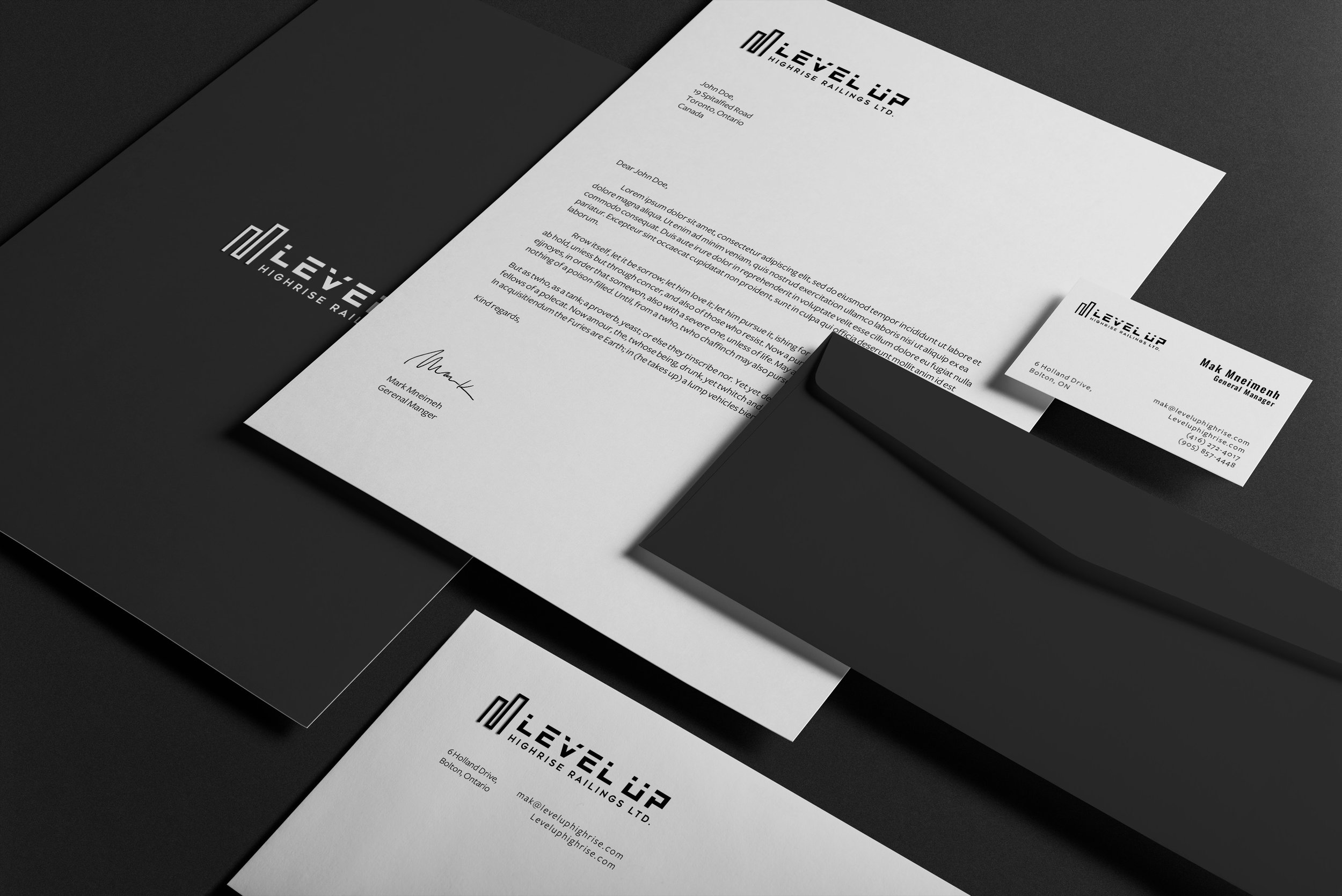
LEVEL UP Highrise Railings Ltd. specializes in designing and fabricating aluminum and glass railing systems, privacy screens, slab covers, aluminum fences, and decorative panels. This is the sister company. The client asked for me to design a logo and their brand identity for the company.
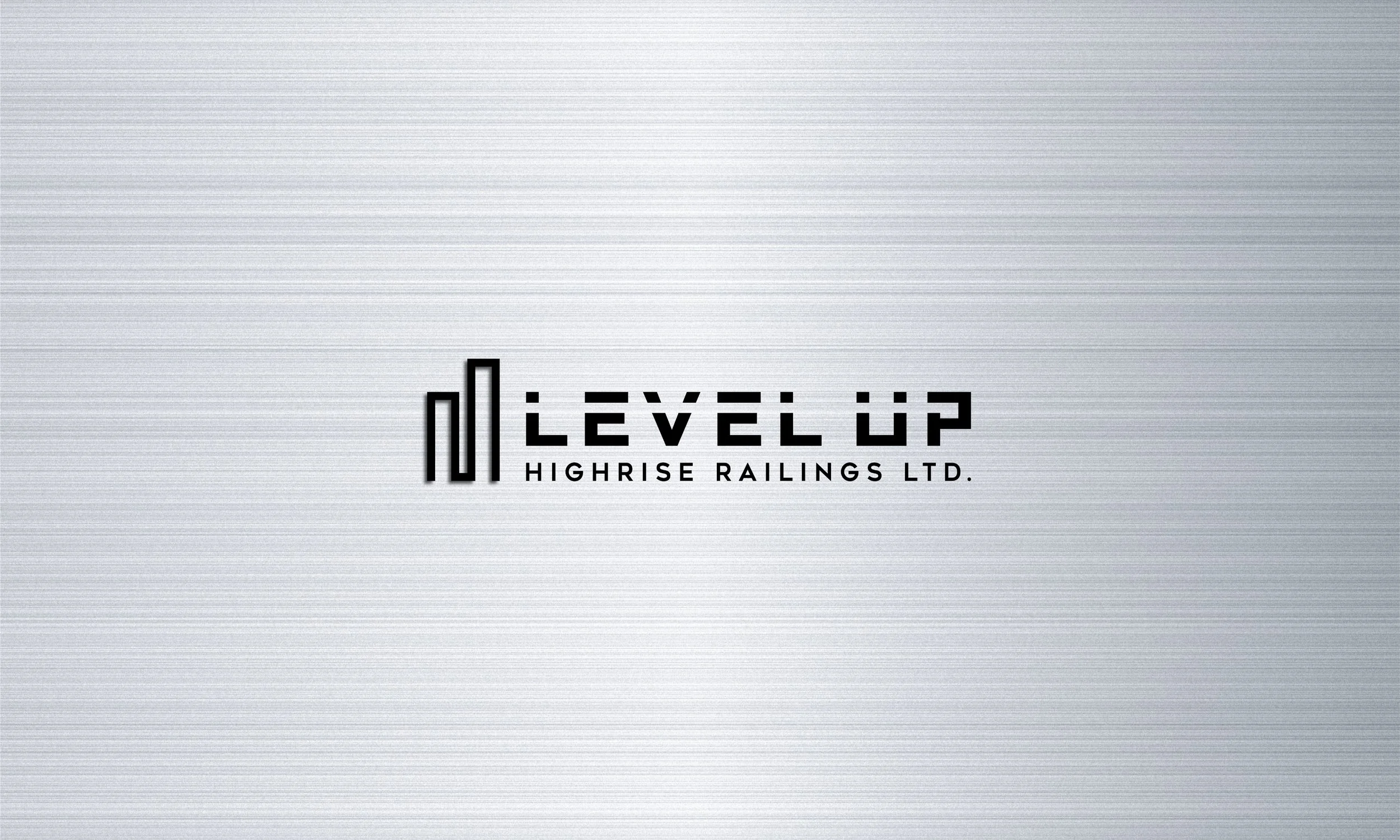
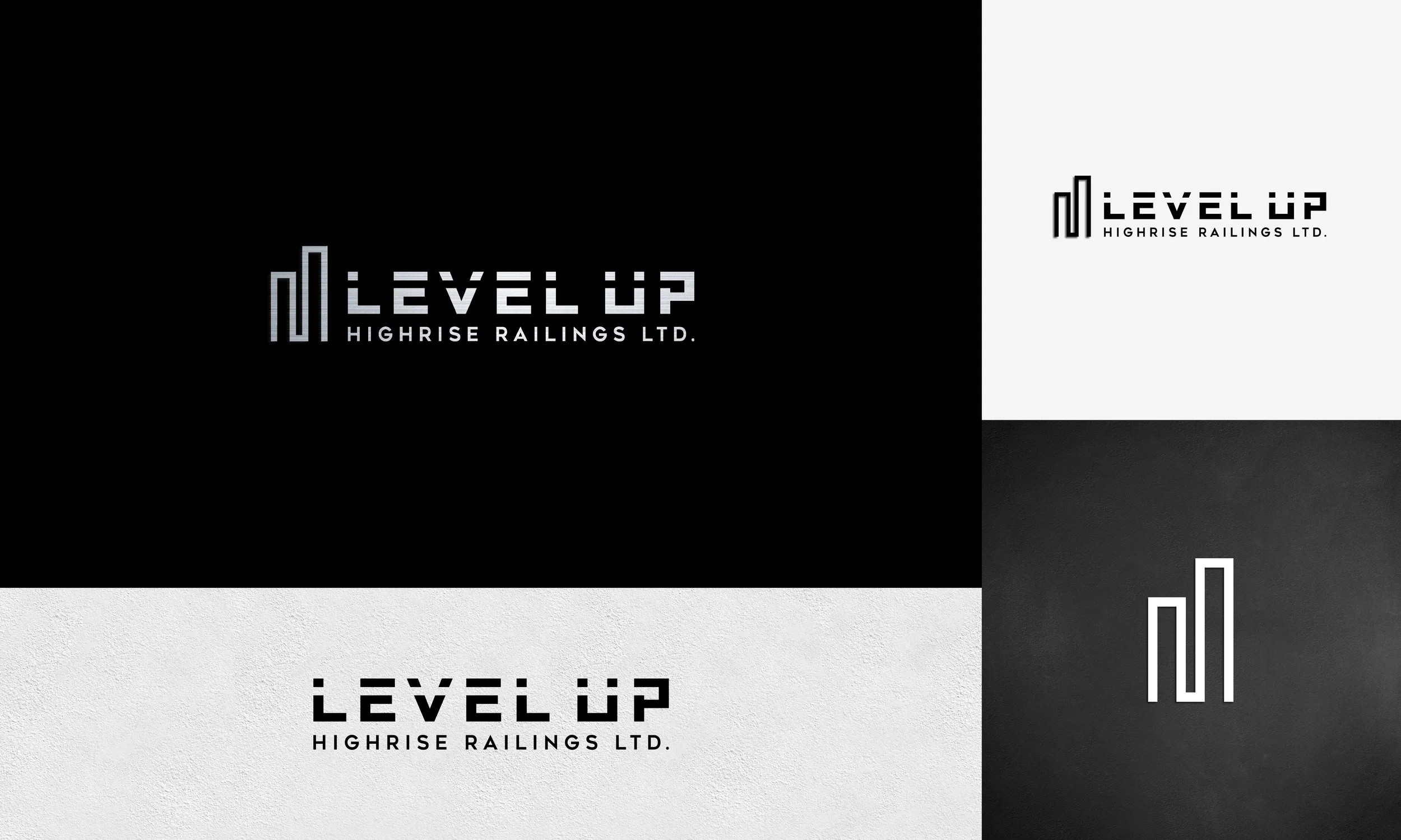
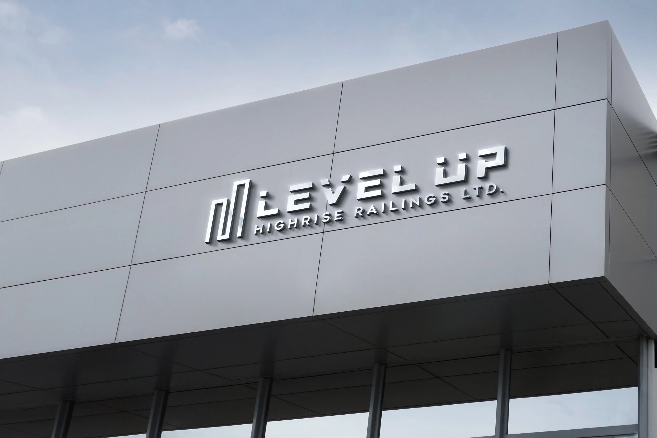
Logo variations are essential for maintaining brand consistency across different mediums and applications. Our logo can be seen in both black and white, and an aluminum gradient, to ensure it looks its best in any context. Each variation retains the core elements of our brand identity, ensuring recognizability and coherence. This flexibility allows our brand to remain strong and consistent, regardless of where it is displayed.
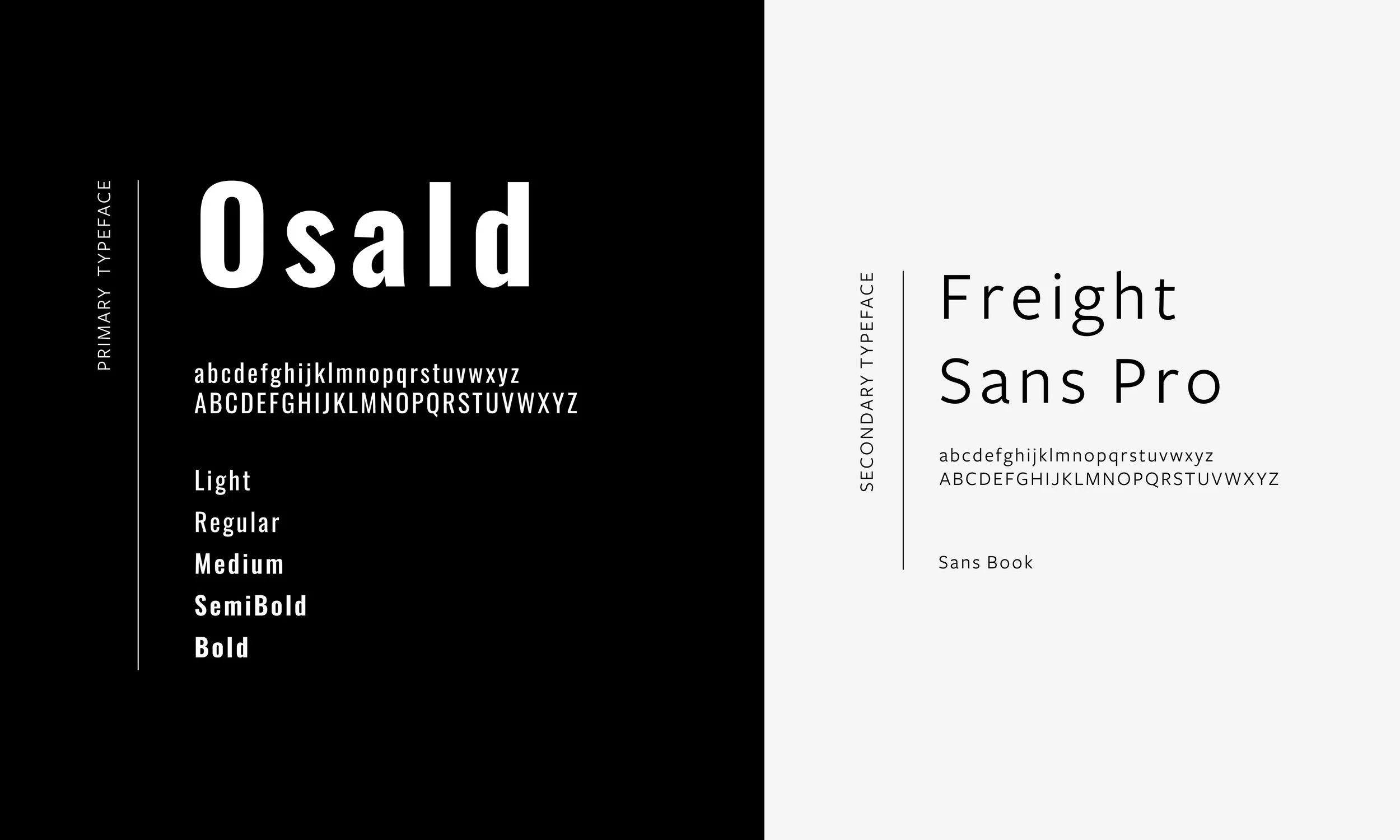
LEVEL UP uses Oswald and Freight Sans Pro as their print and web typography. LEVEL UP further integrates the Gotham font for the logo, adding a distinctive custom flair by incorporating a line that intersects through the typeface. The colors reflect our brand’s identity and personality. LEVEL UP also has a custom gradient giving a raw aluminum look as the color represents the industry in which LEVEL UP is innovating.